MetLife Design System
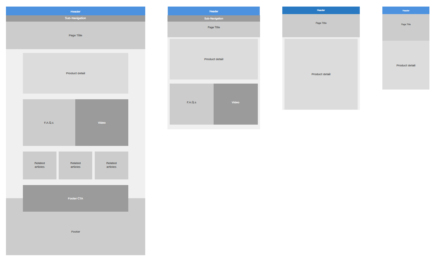
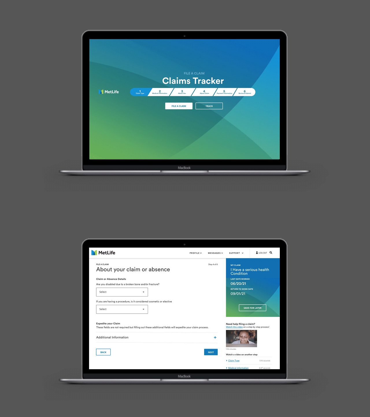
MetLife was at a time when digital transformation was just starting to be a priority. It took the better part of a year to create and implement the design system.
MetLife’s websites & systems were hosted on 3 different CMS platforms: Tridion, Crown Peak and Adobe (AEM). There was an initiative to consolidate & move to a single platform.
KEY TAKEAWAYS
Eliminated redundant hosting fees
A framework of patterns that were flexible, modular and scalable.
Increased build time, efficiency, and reduced duplicate development cost functions.
MetLife Brand Transformation
During that time their 30 year partnership with PEANUTS was coming to an end. All of this added up for a clear transformation to their digital platform & brand. I was on the Customer Experience team which led the Design of this effort.
KEY TAKEAWAYS
A new brand that had a consistent tone of voice, & visual identity across our global markets.
A complete design library that was cost efficient to the markets, from illustration, icons, photography graphics and data visualization.


